圣杯布局和双飞翼布局均用于实现左右定宽,中间自适应的三栏布局,后者是前者的优化版。
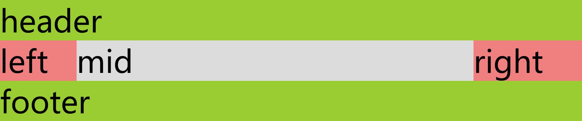
三栏自适应是比较常见的需求,圣杯布局和双飞翼布局则是比较经典的三栏自适应布局实现方法,属于除了“名字起得很好下次别起了”以外都很值得一学,学完就会发现,flex 真是前端之光。
为了让中间栏最早渲染,在编写 HTML 结构时要把中间栏放在边上两栏之前。
圣杯布局
1. HTML 结构
1
2
3
4
5
6
7
| <header>header</header>
<main>
<div class="center">center</div>
<div class="left">left</div>
<div class="right">right</div>
</main>
<footer>footer</footer>
|
重点在于 <main> 中的内容, <header> 和 footer 没有也行,但是我瞅大家都整了所以这里也整了一下。
2. 背景颜色(可选)
便于标识,全凭个人喜好。
1
2
3
4
5
6
7
8
9
10
11
| header,
footer {
background-color: yellowgreen;
}
.center {
background-color: gainsboro;
}
.left,
.right {
background-color: lightcoral;
}
|
3. 浮动
让三栏都浮动起来,这样最后才能让三栏都在“一行”,继续往下看就晓得了。
记得要清除浮动,方法有很多,根据实际情况选择。
1
2
3
4
5
6
7
8
| main {
display: flow-root;
}
.center,
.left,
.right {
float: left;
}
|
4. 设置宽度
- 要让中间栏能够自适应充满(
width: 100%;)
- 设置边栏为定宽
- 中间栏充满后会把一整行都占满,把边栏挤下去,所以要把边栏再移回去(负
margin)
1
2
3
4
5
6
7
8
9
10
11
| .center {
width: 100%;
}
.left {
width: 40px;
margin-left: -100%;
}
.right {
width: 60px;
margin-left: -60px;
}
|
5. 为边栏腾空
此时虽然三栏已经按顺序放在了一行,但实际边栏是盖在中间栏上面的,为了避免中间栏被遮挡,就要把中间栏挤压一下,给边栏留出空白。从这开始就是圣杯布局和双飞翼布局的差别所在,圣杯布局的实现方法是给父元素加 padding,或者 margin。
1
2
3
| main {
padding: 0 60px 0 40px;
}
|
此时边栏还是被挤着,所以要把它们移出去,放在腾出来的空白上。
1
2
3
4
5
6
7
8
| .left {
position: relative;
left: -40px;
}
.right {
position: relative;
right: -60px;
}
|
大功告成。
双飞翼布局
双飞翼布局跟圣杯布局的区别在最后腾空的方法上,双飞翼是直接给中间栏里的内容又套了个壳子:
1
2
3
4
5
6
7
| <main>
<div class="center">
<div class="content">center</div>
</div>
<div class="left">left</div>
<div class="right">right</div>
</main>
|
然后给壳子加个 margin:
1
2
3
| .center .content {
margin: 0 60px 0 40px;
}
|
这样就省得再把边栏移回去了。